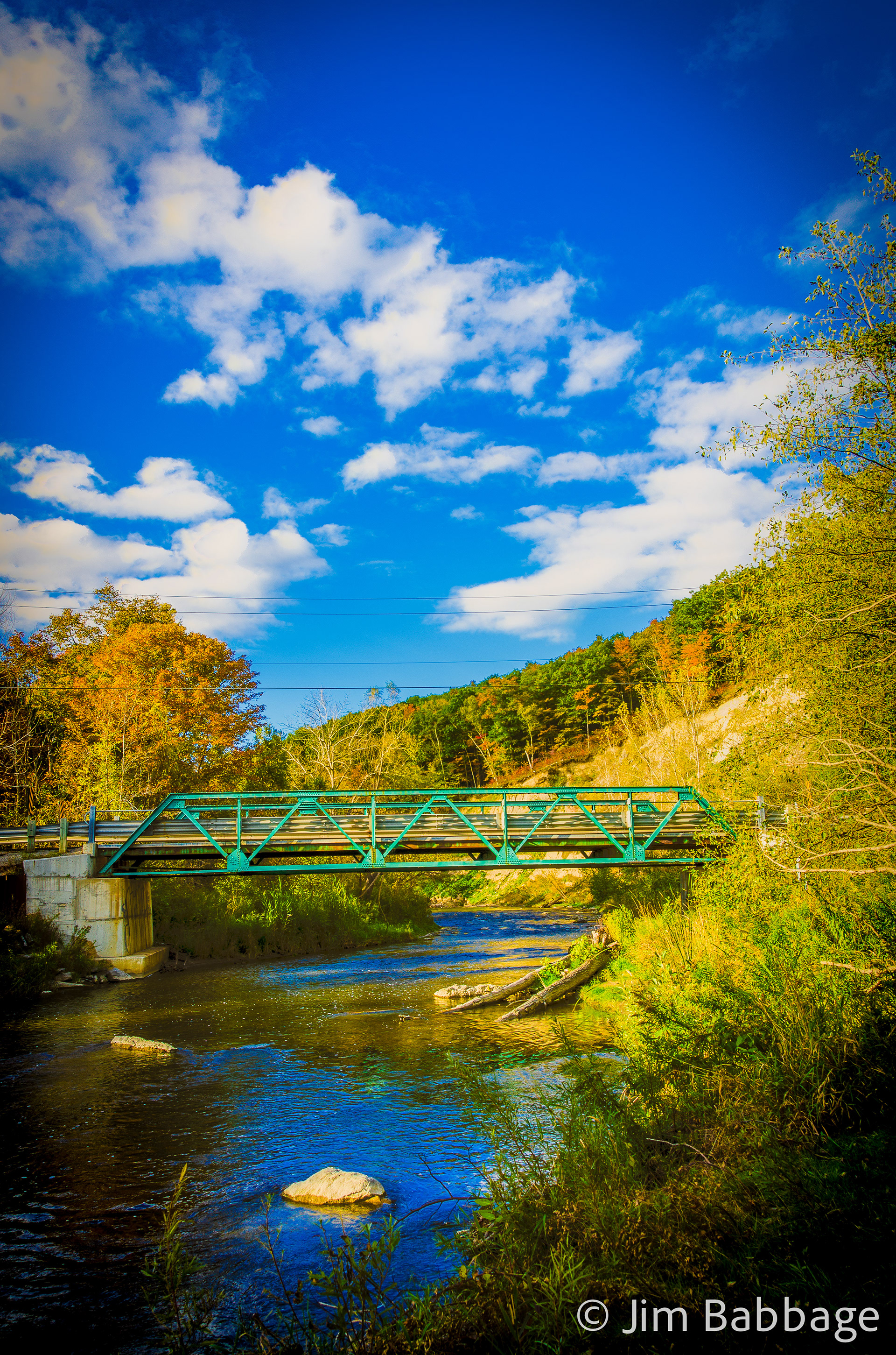
It all started with a walk in the park on Thanksgiving weekend. I had hoped to capture some of the fall color in Toronto, so I took a short drive to the Rouge Park. The color was patchy, but there was color still on the trees (https://www.behance.net/gallery/20441195/A-walk-in-the-park). I parked in the Twyn Rivers parking area and made my way along the shore of the Little Rouge Creek, eventually coming back up on the road. Follwing the road, I crossed two small bridges, the second of which is seen below.
Based on the number of other photographers I'd seen in the area, this view of the bridge, valley and cliffs was a much-photographed scene. In fact, as I crunched my way to the creek's edge to set up, another photographer joked, "Oh, you don't want to shoot that, it's been over-photographed!" I laughed and joked back, "Not by me."
I tried a few slightly different compositions, planning - based onthe contrast of the scene - to shoot an HDR series. On a whim, I quickly snapped an image using Instagram, processed and uploaded the shot, commenting that I hoped Lightroom and my DSLR were up to the challenge of matching what Instagram did.
I was only half joking. I really did like the Instagram version. After editing and processing my base set of images, I decided to try and emulate my Instagram shot.
I came pretty close to the look of my Instagram shot, by first processing the HDR image using Photoshop, then saving out as a TIFF file for further edting in Lightroom. I don't do any processing in ACR, simply becasue I want to retain the history of the process. Final cropping to square (seen later) completed the lomo look.
The three exposures used for the HDR image
Once the HDR and general image processing were completed (increases to Vibrance and Clarity, reductions to Highlights and Whites, Adjustments to Temperature and Tint to cool the image and add a subtle magenta shift and local Saturation adjustments to pump up the fall color), I experimented with post-crop vignetting and also cropped the image to a square format.
The other nagging issue was (of course) the power lines. While I can muck about in Lightroom to try and remove power lines, Photoshop makes this process far easier, quicker and more controllable, by using the Pen Tool to draw a vector path over each power line. Then, while the path is active, select the Spot Healing Brush and choose Stroke Path from the Paths panel. Easy to apply and easy to remove if I flub it. I used this technique on the visible parts of all four power lines and then saved back to Lightroom.
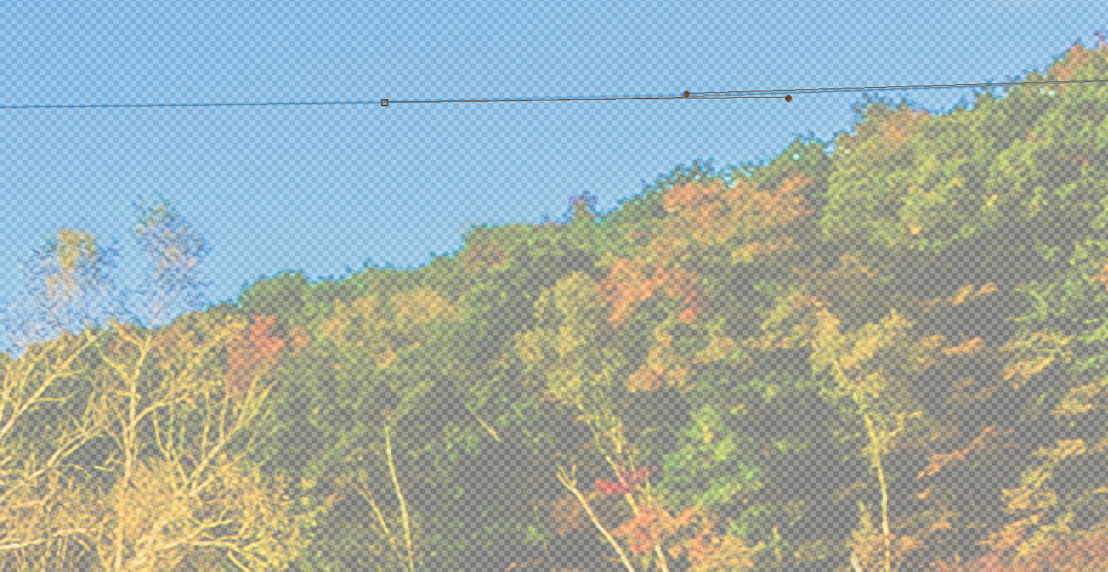
By using a vector path in Photoshop, I have complete control over the curvature of the power lines (NONE of those power lines were perfectly straight) and I can remove each power line in one mouse click (after the path has been drawn and tweaked, by stroking the path with the Spot Healing Brush). I find this FAR easier than trying to use my mouse to draw over the power lines. I also mess that up.
The final result, sans annoying power lines.
When fall color is patchy, consider doing close ups
And this is just what I did for a lot of my walk. Tighter shots like the one(s) below helped to show off the time of year and give that emotional connection to season.
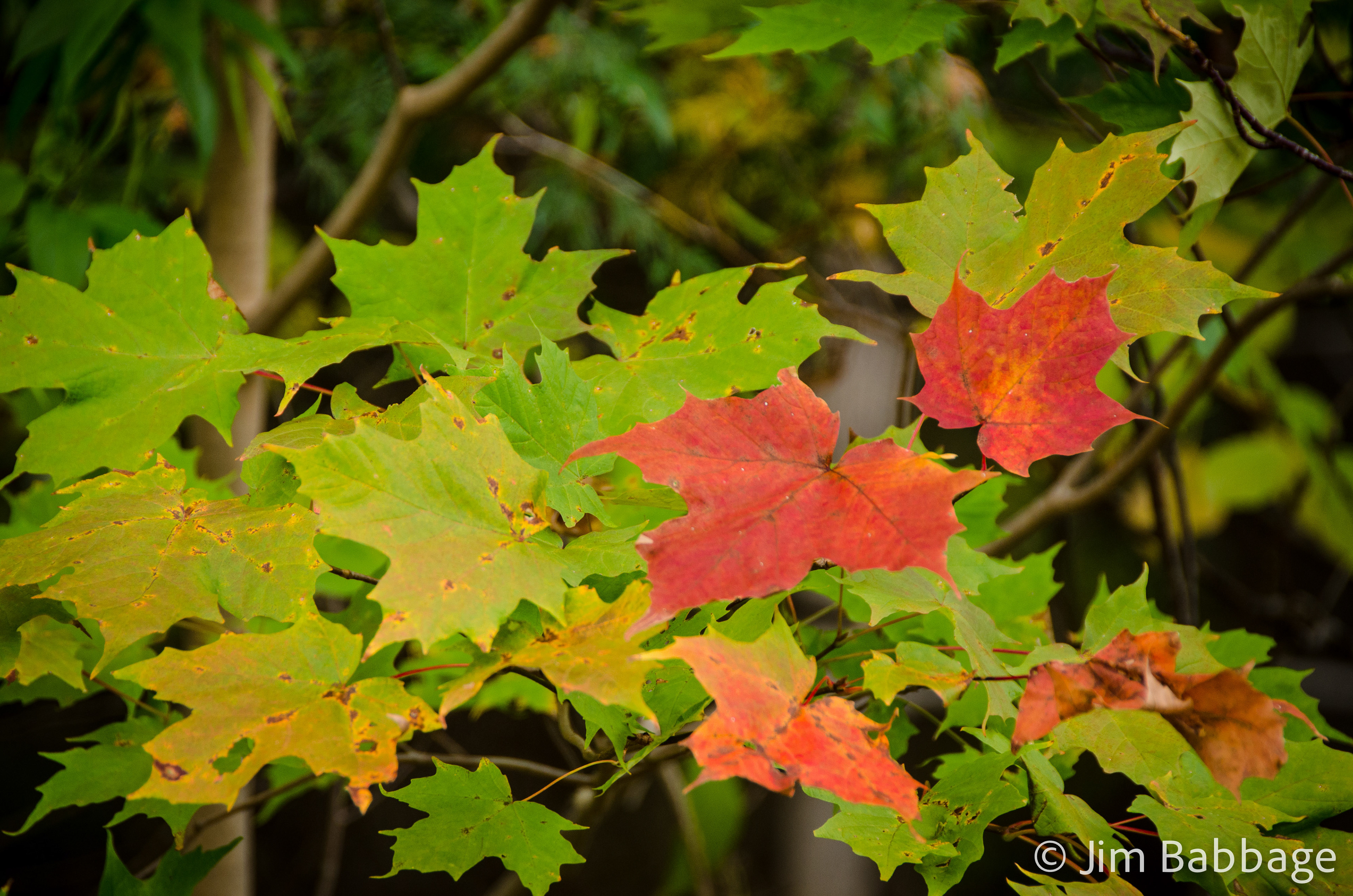
By increasing saturation to the red, orange yellow and green channels, I accentuated this spot of fall color.
However, as I sat on the train heading home from Montreal meetings last night, I caught myself wondering how else I could alter an image to give it more of an Instagram, or Lomography look. I had three hours to kill, and since I create Smart Previews of most of my work, I could have some fun in Lightroom, even without the original images.
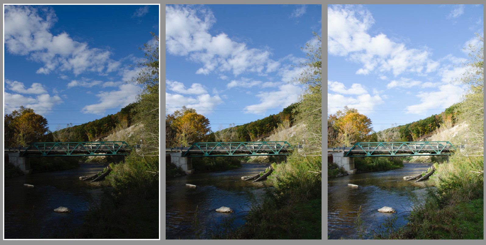
Below are three derivatives of the original image. Between Smart Previews and the ability to easily create Virtual Copies, I was able to experiment freely without worrying about losing a look or style that I liked.
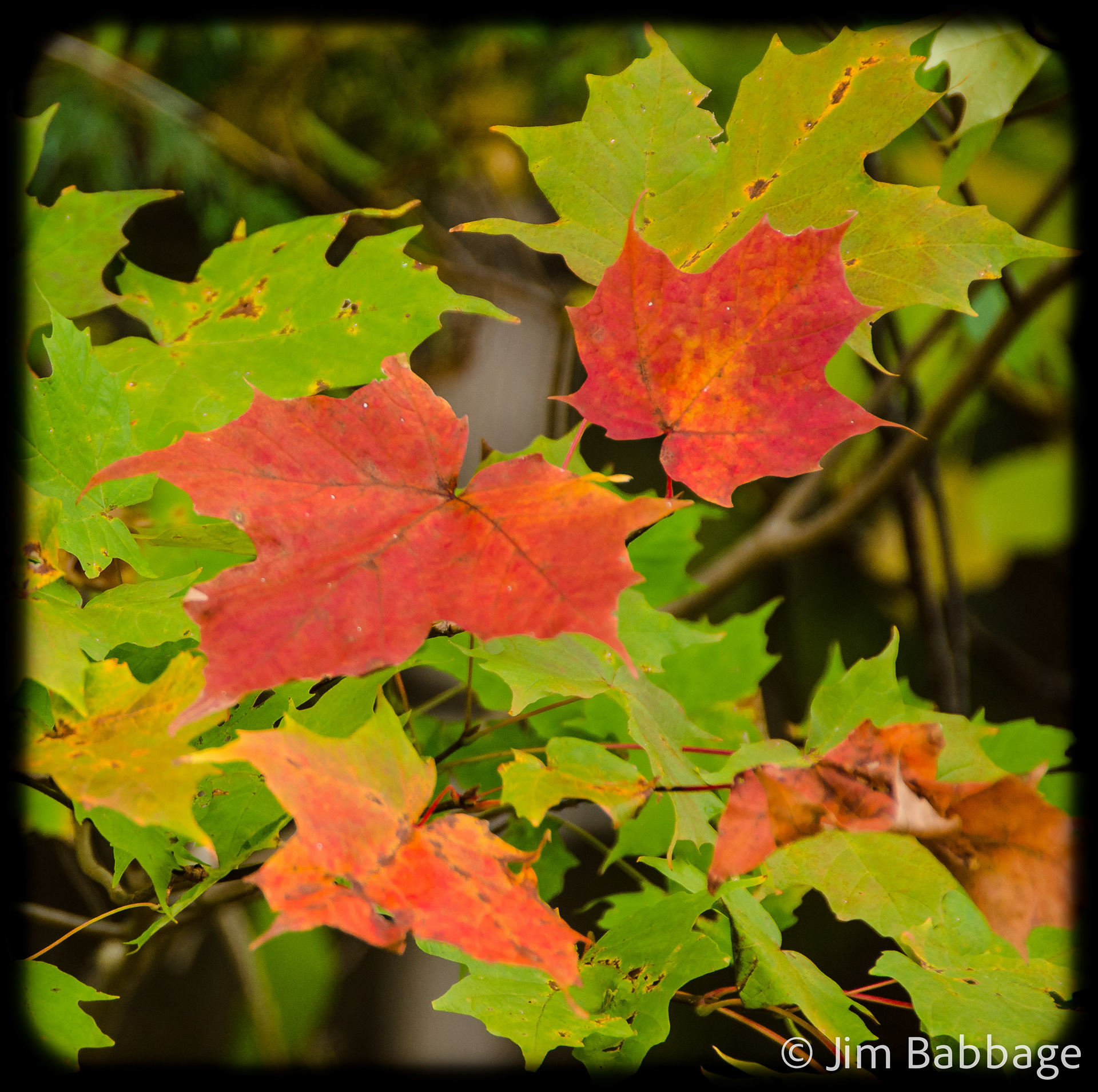
Cropping to a square and creating a custom post-crop vignette (harder edge, lower midpoint value), resulted in this version.
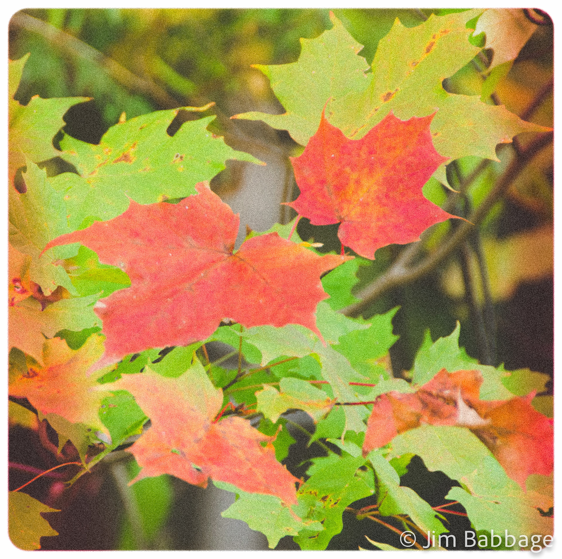
Wanting something more retro, I reduced Saturation and Vibrance, added heavy Grain and a couple Linear gradients to emulate light leaks. I also took the post-crop vignette in the other direction, making it white and hard edged.
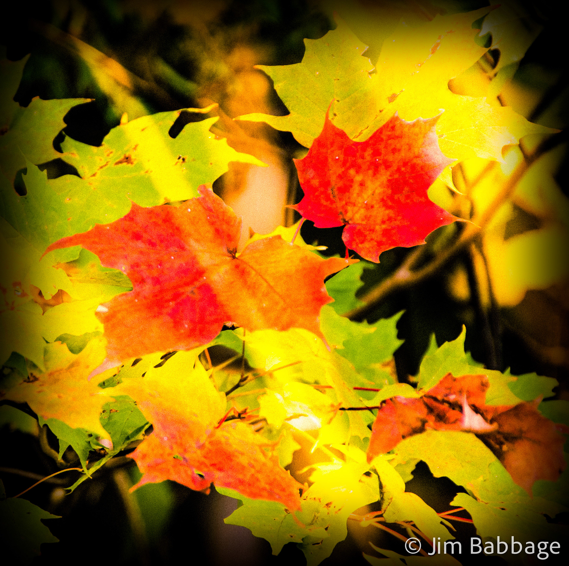
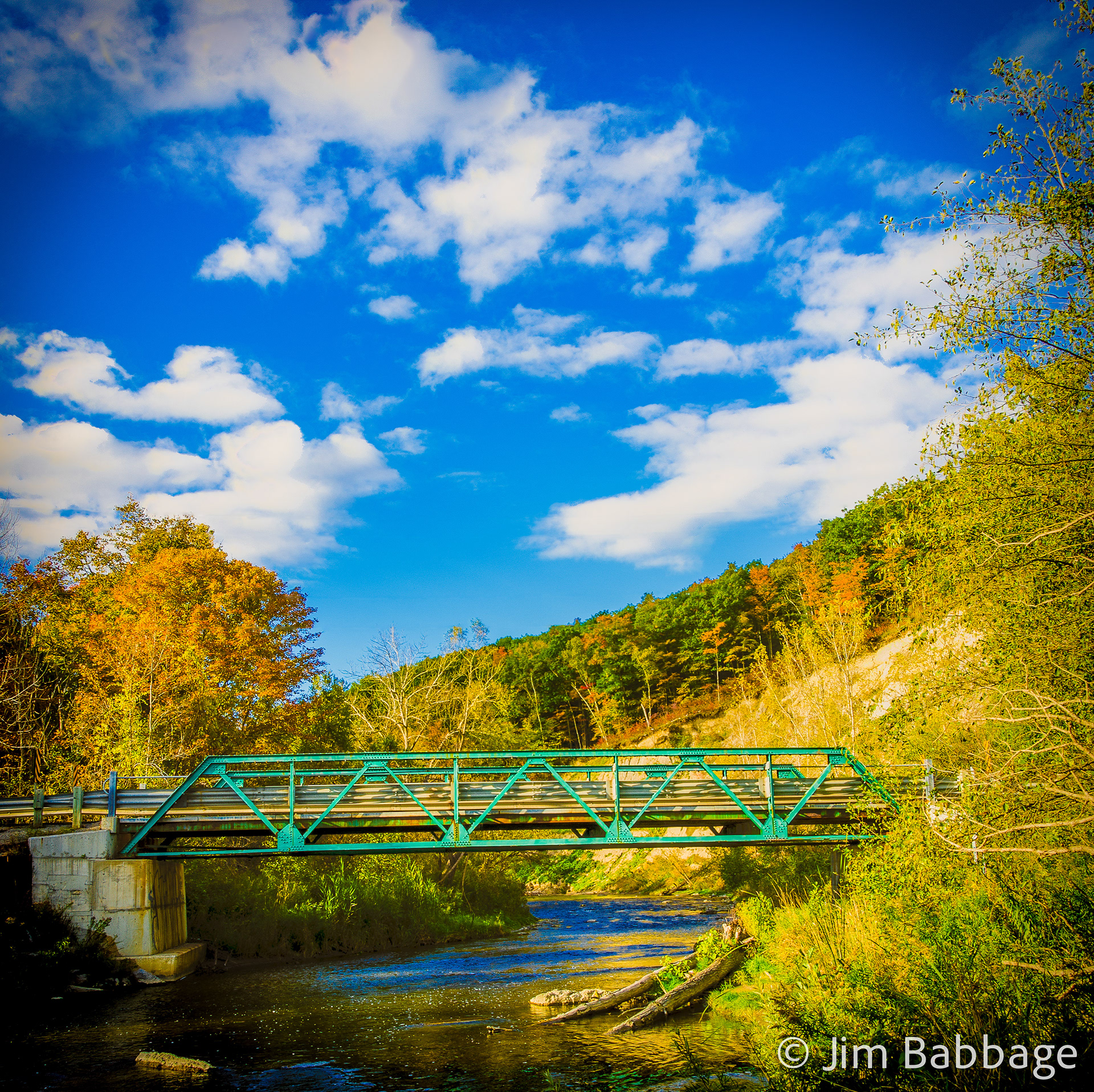
This final rendition is by far is my favorite.
This final rendition is by far is my favorite. A combination of increased Contrast, Clarity, Vibrance, and the addition of Split Toning, gave me the over-saturated, almost cross processed look.
Then, to give that "cheap lens" feel, I created a very soft post-crop vignette with a high value to the roundness, effectively making a soft edged "hole" for the image to show through.
Lastly, I added several very narrow Radial filters which pumped up Exposure and warmed up the Color Temperature within the filters. I placed them randomly and adjusted the widths to make it look like light was spilling all over the place inside the camera.
Tip: You can speed up this process by right-clicking on a selected Radial Filter and choosing Duplicate. Then simply reposition the duplicate filter and adjust to taste.
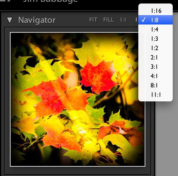
The trick for adding these light leaks is to first reduce magnification in the Lightroom Navigator to 1/8 or 1/16.
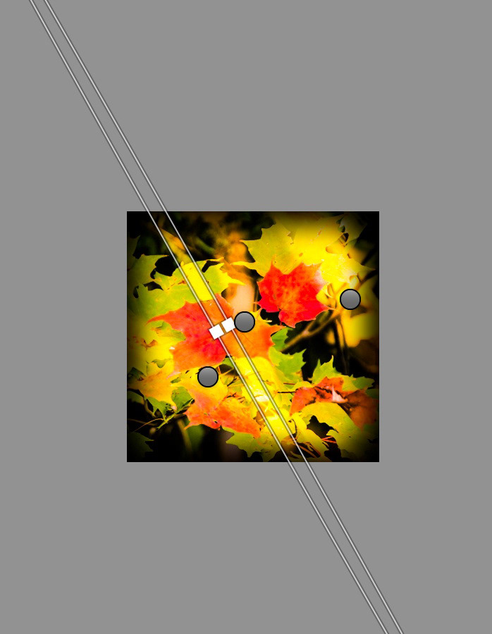
The next step is to draw out a very long, narrow Radial Filter. Adjust the exposure values to suit your needs, then duplicate the filter and reposition/resize as desired.